There isn't one person who has inspired me towards making an infographic but many artists that have put their work out there. The following is a link to the site I like the best for really cool infographics:
http://www.visualcomplexity.com/vc/
Thursday, November 17, 2011
Infographic
For the last project I decided to do either one infographic or several depending on how long it takes to make each one. I like the idea of an infographic showing the importance of music and art in the public school systems. These programs are not only having their funding cut but in some places art and music are being done away with all together.
I found several really promising sites for information and statistics showing the need for the fine arts as well as some cool sites on how to make an infographic.
The first two sites deal with how to make an infographic and the last two are for the fine arts.
I found several really promising sites for information and statistics showing the need for the fine arts as well as some cool sites on how to make an infographic.
The first two sites deal with how to make an infographic and the last two are for the fine arts.
http://sketchup.google.com/intl/en/product/features.html
http://www.makeuseof.com/tag/awesome-free-tools-infographics/
http://childrensmusicworkshop.com/advocacy/factsandstatistics.html
http://www.arteducators.org/research/research
Tuesday, November 15, 2011
Wednesday, November 9, 2011
Winter Park


Wednesday, October 26, 2011
Clownfish painting


star pics


Monday, October 17, 2011
"Have you seen a child the color of wheat?"
My scene for the opera of "Amahl and the Night Visitors" is about the three travelers asking the mother of Amahl about a child the color of wheat, referencing their search for the baby Jesus. When I listened to this scene I am reminded of night falling or day breaking....some change of color happening. I also really liked the idea of doing a stained glass window effect even before I knew what part I was doing it for. I want to make a stained glass window where the colors gradually change from either night fall or day break and once the change has occurred maybe the window opens and there is some type of pastoral scene taking place. Maybe a silhouette of people migrating with animals to the Christ babe.
Thursday, October 13, 2011
JDRF Poster: Walk For The Cure

I really liked the poster project for several reasons: it was something I haven't done before, I got to choose the material, and I learned some neat tricks in photoshop.
My favorite aspect was doing the syringe and making it fractured with people's faces inside. I feel like it adds an aspect of the human side of the disease and how people's lives are directly affected by diabetes.
The most difficult part for me was getting all of the typography to harmonize. I spent more time on the wording than the graphics.
Overall I'm pretty happy with how it turned out and now I feel like I can make a poster for any occasion!
Thursday, October 6, 2011
JDRF Poster Project
JDRF stands for Juvenile Diabetes Research Foundation and is the worldwide leader for researching the cure for Type 1 Diabetes, also known as Juvenile Onset Diabetes. Since its founding in 1970, the JDRF has contributed more than 1.5 billion dollars to research and more than 80% of JDRF's expenditures directly support research and research-related education.
The foundation conducts numerous fundraising events such as walks, rides, online support, and even a children's congress where twice a year children from every state with Type 1 travel to Washington D.C. to advocate a cure.
I want to create an awareness poster for JDRF illustrating the need to not only raise funds for a cure but to educate the public on what Type 1 is and its ordeals that go with it. Many people associate diabetes with over-weight or older people. Type 1 affects children and young adults, some with no pre-existing family condition. Type 1s are also insulin dependent, meaning they must inject insulin for every meal and an additional injection before bed. Knowing exactly who is going to contract this condition is sketchy as most cases there is no warning.
Here is the link to the JDRF home page: http://www.jdrf.org/
Monday, October 3, 2011
Water color exercises


Sundance Square


Thursday, September 29, 2011
Audrey: Timeless Beauty, Endless Grace

This was an Adobe indesign project that was a lot of fun but very challenging. I incorporated the Audrey Hepburn vector drawing along with a biography of Audrey taken from biography.com. I tried to keep the layout simple without a lot of different picture because I feel that simple works well with the elegance of Audrey. I used a pink background that I feel contrasts well with my vector drawing. The photograph of Audrey I reduced by 30% transparency so that the content could be easily read.
I learned quite a bit from this project and about indesign's quirks like wrapping text. The more I worked the easier I was able to manipulate the program but it did challenge me overall.
Thursday, September 22, 2011
"The Balance of Things"

My inspiration came from beautiful sunsets I have seen and my desire to create a study of color. This is the first large project I have completed with oil pastels.


Monday, September 19, 2011
Adele: Chasing Pavements
I didn't know much about Adele when I first saw this video but after watching it I fell in love with her music! The angles and choreographing of this song are amazing and VERY creative. The video is not just another mindless stream of meaningless images that do not correspond to the music. The same amount of attention was paid to both the song and the video, making it quite moving.
Thursday, September 15, 2011

Tuesday, September 13, 2011

Thursday, September 8, 2011
Logos

Thursday, September 1, 2011
Floral Photos....in macro!
 |
| Rose of Sharon |
I use a Canon t3i with a standard 18-55mm lens to photograph my subjects. I zoom in as far as I can and while getting as close as I can to the subject. I currently don't have any macro lenses because they are quite costly, so I make my standard lens work in a macro way.
 |
| Hibiscus |
 |
| Red Rose |
 |
| Tea Rose |
Monday, June 20, 2011
A Textural Project
For me abstract art is harder to make than any other type of art. I have always been into detail and trying to make my art look "real" like a photograph. For our last project in Design 1 we had to make a texture painting. We had to utilize three types of texture: real, invented, and simulated. After the texture we incorporated a simulated object of our choosing and placed it over the painting. I choose a palette knife resting on a rock.
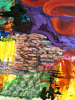
Real texture could be made of sand mixed with paint applied to the illustration board. This type of texture was easy because it used real substances. I used sand and small glass beads. This photo shows a simulated rock that has different sizes of sand incorporated into the paint.
Invented texture was fairly easy because you could make up anything. For example, painting many tiny dots in white onto a red background or using impasto to build up a very thick area with interesting ridges. I used pure paint from the tubes and tried to avoid mixing colors too much. The impasto gave the background a lot of texture.
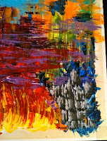
Simulated texture was the most difficult. For this type we had to copy a real texture such as tree bark and it had to look real. This type was the most time consuming because the colors had to be mixed correctly and tones and shades had to be put in the correct areas to create depth. This photo shows a small area of oak bark I painted.
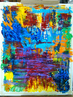
My painting turned out very abstract and it is the first truly abstract piece I've done. I initially played with colors straight out of the tubes with a palette knife and covered the illustration board with interesting textures. I tried to keep complementary colors together to enhance some areas. Once I had my background I decided to incorporate the simulated and real textures within the invented ones to tie in all the areas together.
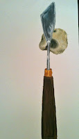 The last thing I made was the palette knife and rock which had to look real but were painted and cut out from a piece of illustration board and then glued on to the surface of the painting. I wanted my focal piece to look real so I even included a scoop of purple paint on the knife as though it had just been used.
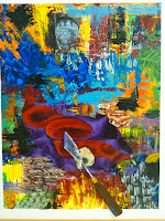
I learned that letting go and having fun with color can sometimes turn out better than if you had planned each detail. Using the abstract method and then combining some detail made this project a lot of fun and taught me that you can have both detail and abstract in the same work complementing each other to great effect.

Real texture could be made of sand mixed with paint applied to the illustration board. This type of texture was easy because it used real substances. I used sand and small glass beads. This photo shows a simulated rock that has different sizes of sand incorporated into the paint.

Invented texture was fairly easy because you could make up anything. For example, painting many tiny dots in white onto a red background or using impasto to build up a very thick area with interesting ridges. I used pure paint from the tubes and tried to avoid mixing colors too much. The impasto gave the background a lot of texture.

Simulated texture was the most difficult. For this type we had to copy a real texture such as tree bark and it had to look real. This type was the most time consuming because the colors had to be mixed correctly and tones and shades had to be put in the correct areas to create depth. This photo shows a small area of oak bark I painted.
My painting turned out very abstract and it is the first truly abstract piece I've done. I initially played with colors straight out of the tubes with a palette knife and covered the illustration board with interesting textures. I tried to keep complementary colors together to enhance some areas. Once I had my background I decided to incorporate the simulated and real textures within the invented ones to tie in all the areas together.
 The last thing I made was the palette knife and rock which had to look real but were painted and cut out from a piece of illustration board and then glued on to the surface of the painting. I wanted my focal piece to look real so I even included a scoop of purple paint on the knife as though it had just been used.
I learned that letting go and having fun with color can sometimes turn out better than if you had planned each detail. Using the abstract method and then combining some detail made this project a lot of fun and taught me that you can have both detail and abstract in the same work complementing each other to great effect.
Inspriation
What is your inspiration? Do you get creative ideas from listening to music or taking a walk outside? Different things may inspire us to be creative in different ways, and for some of us it is knowing what to do with that inspiration. Sometimes we are inspired but don't do anything with it and the inspiration goes away.
When I feel inspired I like to use a notepad to keep notes on what painting or sculpture I want to make next. This way I don't forget my inspired idea when I don't have time to start right away. Making notes along with a rough sketch can help you to remember exactly which direction you wanted to take your artwork and I've noticed that if you wait a few days and come back to your notes you can get a different perspective on an area that will work better than originally planned.
All you need is a pen or pencil and a blank piece of paper. Keep your ideas in a folder for later reference and so you don't lose it for when you do want to work on it. It's fun to go back through all of your ideas much later and see which ones worked out and which ones didn't.You can also see which areas needed more substance and what you could have done different that would have worked out better.
Next time you're feeling inspired don't let it go to waste! Jot down some quick ideas and see where it goes. You just might be surprised at where your inspiration can take you.
Subscribe to:
Comments (Atom)